top of page
Laura AlSalem
Kimono
Kimono, a take-out sushi restaurant inspired by its mother branch, Tokyo. Upon developing on the logo, the client was further inspired to create an entire narrative built off the character featured in it. Thus, Kimono, the girl, the itamae, was born.
Service
Branding
Packaging
Client
Foodsgate
Year
2018


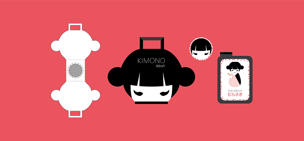
With the creative packaging. The character 'Kimono' was included within most of the branding's collateral.
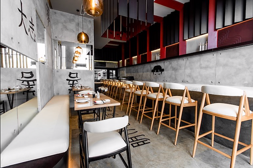
The Place to Be
In early 2019, the sushi joint was at last opened for its curious visitors. The branding had also been executed within the actual interior, which in this case has only further added value to the brand itself, as well as, its memorability.


bottom of page